Hidden Meanings In Logos
Think again! Lots of well-known companies like these have hidden meanings behind their logos.
August 31, 2018
Google. Wendy’s. Amazon. These companies seem to have regular, everyday logos, right? Think again! Lots of well-known companies like these have hidden meanings behind their logos.
- Amazon
Amazon is one of the most popular online shopping platforms in America. Whether you’re shopping for your mom’s birthday, or you just want a little treat for yourself, you can always depend on Amazon. But did you know that its logo also depicts its awesomeness? In the logo, an arrow connects the ‘a’ and ‘z’ in “Amazon.” This is supposed to illustrate that they sell everything and anything, from ‘a’ to ‘z’. It also represents the smile that their customers hopefully wear when shopping on Amazon!
2.Wendy’s
Ah, Wendy’s. Beloved Wendy’s. Home to the best Frosties you could ever taste. We all know that Wendy’s is all about that warm homey feeling as if your own mom had made your Chocolate Frosty. But what you didn’t know is that they actually incorporated that into their logo. If you look closely at Wendy’s collar, you will see that the word “mom” is written, using the blue stripes of the collar as M’s, and the blue circle in the middle as an “o”.
3. BMW
BMW is a well-known car brand. As we all know, it’s logo is a circle within a circle, cut into blue and white fourths. But what some of you may not know is that the logo actually has the colors of the Bavarian flag: blue and white. It actually is based on Rapp Motor Works’ logo. Some people also think that the logo may represent the blades of a spinning propeller.
4. Baskin Robbins
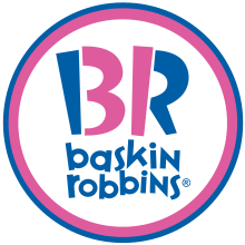
Chocolate Almond! French Vanilla! Recognize these flavors? If you’ve been to Baskin Robbins, you know that these ice cream flavors are some of the many delicacies you can find at Baskin-Robbins. Baskin-Robbins is known for their 31 flavors, and they proudly show it off by presenting it in their logo. Using the colors blue and pink, the pink section in the “B” and “R” in Baskin-Robbins logo double as the number 31. Well played, Baskin Robbins, well played.
5. Google
How did you get to this beautiful Day Creek Howl site? By Googling it, of course! Now you may be thinking, what’s the hidden meaning? There are no hidden images, no fancy fonts. So what’s their secret? Google decided to translate their message with colors. Their message is that they don’t play by the rules, and they can do whatever they want. So what do they do? They use primary colors and then throw in a secondary color to make the “l” green.

